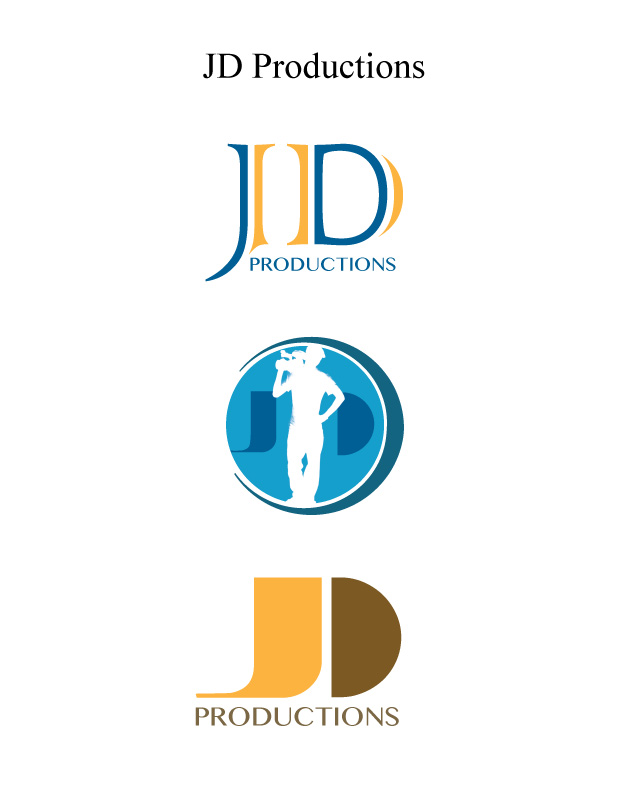
Portfolio Project

Justin Dial

  • Project Corrections / Time spent:

2 hours

1.5 fixing Dr. Pepper image. Tweaking the text on the bottom right.

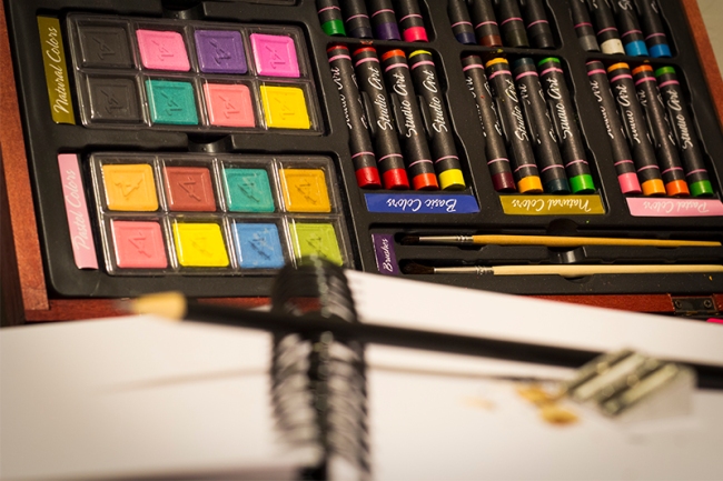
.5 hours fixing the drop shadow other small details in the photo montage.

  • Message:

The message of my portfolio is that I am a dedicated learner. What I don’t know I can study up on and find a solution. I am a problem solver. Who ever I work for I make their job easier. I bring solutions to the boss, not problems.

  • Audience:

To those who enjoy visual media this is for you. The hope is that this will reach the desk of one of my future employers along with any additional work that I create in the next 2 years here at BYU-Idaho.

  • Top Thing Learned:

Pirate’s code – Just because you can doesn’t mean you should.

Photography – Get it right the first time in production avoids problems in post production work flow.

There is no such thing as too much preproduction.

The best designers are always drawing.

  • Future application of Visual Media:

As a videographer knowing design skills will aid me in the layout and design of any slates or motion graphics created.

  • Color scheme and color names:

Monochromatic; Blue

  • Title Font Name & Category:

Iowan Old Style, Serif

  • Copy Font Name & Category:

Iowan Old Style, Serif

  • Thumbnails of Images used:

left right

  • Sources (Links to images on original websites / with title of site):

http://honey-stock.deviantart.com/art/ice-texture-for-oss-funfair-167357464

http://interactiveblend.com/blog/creative/free-adobe-cs6-vector-icons-download/

Project 8 – Brochure

IMG_0232-smallIMG_0229-small


Screen Shot 2014-07-12 at 7.05.49 PM Screen Shot 2014-07-12 at 7.06.06 PM

IMG_0235-small


Description: Simple brochure for LDS-BSA Relations designed to explain the purpose of a series of Scouting stories that help promote scouting and how you can help!

Process (Programs, Tools, Skills): Using Indesign, Illustrator and Photoshop I touched up the logos and photos and placed them in the design. After my first draft I saw an opportunity when trying how to fold it. I found that the bottom part of the page could fold in from of the top part when folded in half to do a reveal of the scouting logos, which I thought was cool.

Message: The message is to help promote scouting through personal experiences in scouting. These positive uplifting experiences that have helped adults and youth become better citizens in their country and community. This brochure explains the types of stories we are looking for and how to submit them.

Audience: The target audience is anyone who is involved with scouting or have be impacted by the program that have a desire to share their story with the world.

Top Thing Learned: The most important thing I learned while doing this process was how to think three dimensionally. You had to visualize in your head how the brochure was going to fold and plan accordingly.

Color scheme and color names: Triadic, yellow/Gold, Red/brick, Green

Title Font Name & Category: Sanford, Oldstyle
Copy Font Name & Category: Oswald, San serif
Word Count of copy: Not including the quote 350
Thumbnails of Images used:

   IMG_0239-small Screen Shot 2014-07-12 at 7.06.06 PMScreen Shot 2014-07-12 at 7.05.49 PMIMG_0232-small IMG_0235-small IMG_0229-small

Sources (Links to images on original websites)

http://www.scouting.org/Home/Marketing/Brand/logos.aspx

http://photoluminary.com/wp-content/uploads/2011/02/plain-brown.jpg

http://etc.usf.edu/clipart/70400/70447/70447_263_ra-030_s.htm

Project 6: Stationery

JustinDialstationary JustinDialstationary2 JustinDialstationary3

  • Description:

Unified stationery and business card for Baseball and Life Skills camp made in Illustrator and InDesign.

  • Process (Programs, Tools, Skills):

Using InDesign and Illustrator I started with the idea of a Baseball mound and a baseball flying in over the text, but after it was critiqued I decided just on a simple text design and a baseball as a water mark.

  • Message:

The basic design was for branding toward those who enjoy baseball and want to learn more,

  • Audience:

All those who enjoy baseball and want to gain skills to help them in their careers and in life.

  • Top Thing Learned:

The thing I struggled the most with was coloring the text by breaking down the text by creating outlines and then isolating the compounds and filling in the individual elements

  • Color scheme and color names:

Monochromatic – Red

  • Title Font Name & Category:

Trajan Pro 3 – Oldstyle

  • Copy Font Name & Category:

Geneva CY – San Serif

Project 5: Logos

JustinDial-P5Logos


  • Description:

These are some logo designs I made for myself as a freelance videographer and editor.

  • Process (Programs, Tools, Skills):

I had some sketches and ideas for what I wanted as a logo. The hardest part was settling on a name or image for people to identify with me and my skill set. Using Illustrator I used the image trace tool from a picture of me holding a camera. I bumped up the contrast in Photoshop to give it the silhouette look. Then it was deciding on a font which was difficult.

  • Message:

These are simple logos for the audience to identify with my work.

  • Audience:

My target audience are those who need video as a medium of communication for them and their message.

  • Top Thing Learned:

Object > Path > Outline Stroke was shown to our class by Brother Kerr. this tool allowed me to create the incomplete circle in my middle logo. I also knew of  the Width Tool (Shift + W) to adjust the width of paths, but this was my first time have a purpose to use it.

  • Three Color Scheme and Color Names:

Top: Complimentary (Gold, Indigo)

Middle: Monochromatic (Blue)

Bottom: Monochromatic (Gold)

  • Three sets of Title / Body Font Names & Categories:

Colonna MT (Decorative)

Braggadocio (Decorative/Hybrid)

Braggadocio (Decorative/Hybrid)

  • Votes on favorite logo:

Top Logo = 4 ; Middle Logo = 4; Bottom Logo = 6;

  • My favorite logo is the Middle one.


Project 4: Montage

JustinDial-P4Montage-Baseball


  • Description:

Montage I created for brother who is walking in his brothers (me) footsteps.

  • Process (Programs, Tools, Skills, Steps taken while designing):

This project was difficult because I had to decide which pictures I wanted. I ultimately had to redesign it. I started with a set of four pictures layered on top of each other that I took in burst mode on my Canon 60D. The goal was to make a montage and for this those for pictures looked more like a composite. When it was critiqued someone suggested I make it look like a baseball card. and in the end I came up with this. my first idea required masks for each layer, but my final design it required only one and was much easier. Also in my initial draft I used the Automate > photomerge feature in photoshop. So I was basically making it to hard for me. This goes to prove that we have to be willing to sacrifice what we really want in a design for something that will ultimately look and feel ten times better.

  • Message:

Baseball is an American past time. Poster for my Brother.

  • Audience:

This goes out to all the avid baseball players, but is mostly intended for my little brother.

  • Top Thing Learned:

Less is more. I was trying use too many photos which ultimately impeded the gestalt of the design.

  • Filter / Colorization used and where it was applied:

I added a slight drop shadow on my brother’s name and his jersey number. I also applied a vibrance mask to make the color in his shirt pop.

  • Color scheme and color names:

Monochromatic red

  • Title Font Name & Category:

Modern No. 20

  • Thumbnails of Images used:

IMG_2005-Small IMG_1995-small chainlink-fence-texture-small


  • Sources (Links to images on original websites / with title of site):

http://www.psdgraphics.com/file/chainlink-fence-texture.jpg

Other photos were taken by me.

Project 3: Photodesign

Image


design” blog post.

  • Description:

I was thirsty today, so I went to my fridge opened it up looking for something refreshing. I pull out a Dr. Pepper walk back to my room and before I open it up I think to myself this is great moment, I should take a picture of it for my Visual Media class. We had to incorporate a color scheme based on the pictures we took and create a full-bleed 8.5 x 11 photodesign.

  • Process (Programs, Tools, Skills):

I grab my chair and drag it out to the hallway where there’s no light except a sliver of light falling on the Dr. Pepper can coming from my bedroom. I grab my Canon 60D with my 50mm 1.8 lens and set it on my tripod. I extended the tripod legs to get eye-level with the Dr. Pepper. Then I grab my little LED flash light that kicks out some extreme light. I crank my aperture down to f9 to get the whole can in focus but also to get some of the star effect you get when your aperture is at f22. I set my shutter at 5 seconds and set the timer on my 60D to give me time to go down the hallway and click my flashlight on for a couple of second. I then brought it into photoshop and pulled back some of the rich brick red and gold colors of the can.

  • Message:

Buy a Dr. Pepper.

  • Audience:

My target audience is those who enjoy a nice refreshing Dr. Pepper and for those who haven’t tried it.

  • Top Thing Learned:

I incorporated more than a few adjustment layers allowing me to adjust only the brick reds and gold colors of the can.

  • Color scheme and color names:

Split Complimentary. Brick, Gold, Blue.

  • Title Font Name & Category:

Humanist 521 B, Sans Serif

  • Copy Font Name & Category:

Adobe Devangari, Oldstyle

  • Thumbnail of original, unedited image inserted

Image

  • Date and location you took the photo

5/19/14, My Apartment Hallway

P3 Activity: Photography

Image

Light – Outside

Image

Light – Inside

Image


Foreground

Image

Background

Image


Composition – Rule of Thirds

Image

Lead Room


This was the most fun I’ve had up to this point in the semester. I’ve always enjoyed photography and I was blown away by the sunset that I was able to capture in a time lapse (if you care to watch 20 minutes in 10 seconds have take a look https://www.youtube.com/watch?v=FidivFJRtwE). It took a while for me to find a good location overlooking the Rexburg area but in the end it didn’t matter because to get the vibrant colors of the sky Rexburg was forced into darkness. 
Another photo favorite of mine was the Dr. Pepper. This was made in my hallway where it was dark. I was thirsty so I grabbed a Dr. Pepper out my fridge and thought, I should take a picture of this. I then grabbed a chair from my room. Sat the Dr Pepper on it, my camera on my tripod and my little flashlight. I set my setting to 2 seconds, open my aperture up to get that shallow depth of field, put my camera on a timer, hit the trigger ran behind my camera turned on my flashlight and pointed it back at my Dr. Pepper.


Project 2: Event Ad

Image

  • Description: This project required me to scan an image of my choice from a magazine and create a design using the pictures I scanned for creative poster promoting a fictitious event or charity. I choose golf because It’s spring time and I’ve been itching to get out and play a round of golf, but since learning takes priority I’ll just make the best with what I have.
  • Process (Programs, Tools, Skills): In this scenario we were limited to Microsoft Word. I feel giving yourself limitation can only enhance your creativity. We emphasized color in this project choosing a color scheme and implementing it into our design.
  • Message: What a better way to justify spending $25 dollars on a round of golf than helping those less fortunate than ourselves? My Idea was to have golf scramble and that all the money would be donated to the blind and visually impaired.
  • Audience: My target audience are those who enjoy playing golf and have been effected one way or another by the loss of sight, whether in their own family or a close friend.
  • Color scheme and color names: Monochromatic – Red
  • Top Thing Learned: This doesn’t pertain so much to design as it does the program and printing, but I thought it was cool that you could set your margins when printing by going to file > page setup > manage custom sizes, and set your margins to zero allowing the printer to control how close it could print to the edge instead of the computer or program.
  • Title Font Name & Category: Arial Black, San Serif
  • Copy Font Name & Category: Cambria, Oldstyle
  • Scanned images used, sources, original sizes, location of scanner used:

Image


  • Golf Magazine (Library)
  • 8.5 x 11
  • Library, 1st floor

Project 1 Flier

Image


  • Description:

This is a flier made for my visual design class to aimed at soon to be college graduates inviting them to come to a graduate conference.

  • Process (Programs, Tools, Skills):

This flier was made in Adobe Indesign and required me to use my newly learned knowledge of design.

  • Message:

The central message and call to action in this flier is to get juniors and seniors to attend this graduate leadership conference

  • Audience:

The target of audience of this flier are the juniors and senior who are graduating and looking to launch their careers.

  • Top Thing Learned:

I have used Indesign previously but learned quickly how to turn guides on and off. I also learned the keyboard shortcuts for sending layers backwards and bringing them forwards. I learned how to adjust the image quality on images that have been placed and linked into the documents.

  • Title Font Name & Category:

DTL Documenta Sans T (Sans Serif)

  • Copy Font Name & Category:

Times (Serif)

  • Links to images used in this project:

https://130.commbyui.org/wp-content/uploads/2013/01/JuliePeterson-Leadership-conference-business-rexburg-Idaho_7564-as-Smart-Object-1.jpg