Portfolio Project

Justin Dial

  • Project Corrections / Time spent:

2 hours

1.5 fixing Dr. Pepper image. Tweaking the text on the bottom right.

.5 hours fixing the drop shadow other small details in the photo montage.

  • Message:

The message of my portfolio is that I am a dedicated learner. What I don’t know I can study up on and find a solution. I am a problem solver. Who ever I work for I make their job easier. I bring solutions to the boss, not problems.

  • Audience:

To those who enjoy visual media this is for you. The hope is that this will reach the desk of one of my future employers along with any additional work that I create in the next 2 years here at BYU-Idaho.

  • Top Thing Learned:

Pirate’s code – Just because you can doesn’t mean you should.

Photography – Get it right the first time in production avoids problems in post production work flow.

There is no such thing as too much preproduction.

The best designers are always drawing.

  • Future application of Visual Media:

As a videographer knowing design skills will aid me in the layout and design of any slates or motion graphics created.

  • Color scheme and color names:

Monochromatic; Blue

  • Title Font Name & Category:

Iowan Old Style, Serif

  • Copy Font Name & Category:

Iowan Old Style, Serif

  • Thumbnails of Images used:

left right

  • Sources (Links to images on original websites / with title of site):

http://honey-stock.deviantart.com/art/ice-texture-for-oss-funfair-167357464

http://interactiveblend.com/blog/creative/free-adobe-cs6-vector-icons-download/
Project 8 – Brochure

IMG_0232-smallIMG_0229-small


Screen Shot 2014-07-12 at 7.05.49 PM Screen Shot 2014-07-12 at 7.06.06 PM

IMG_0235-small


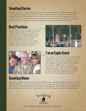
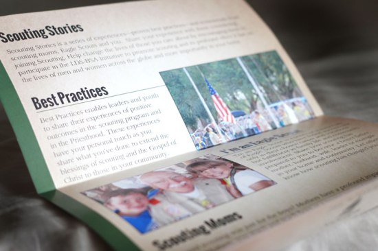
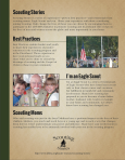
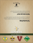
Description: Simple brochure for LDS-BSA Relations designed to explain the purpose of a series of Scouting stories that help promote scouting and how you can help!

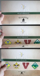
Process (Programs, Tools, Skills): Using Indesign, Illustrator and Photoshop I touched up the logos and photos and placed them in the design. After my first draft I saw an opportunity when trying how to fold it. I found that the bottom part of the page could fold in from of the top part when folded in half to do a reveal of the scouting logos, which I thought was cool.

Message: The message is to help promote scouting through personal experiences in scouting. These positive uplifting experiences that have helped adults and youth become better citizens in their country and community. This brochure explains the types of stories we are looking for and how to submit them.

Audience: The target audience is anyone who is involved with scouting or have be impacted by the program that have a desire to share their story with the world.

Top Thing Learned: The most important thing I learned while doing this process was how to think three dimensionally. You had to visualize in your head how the brochure was going to fold and plan accordingly.

Color scheme and color names: Triadic, yellow/Gold, Red/brick, Green

Title Font Name & Category: Sanford, Oldstyle
Copy Font Name & Category: Oswald, San serif
Word Count of copy: Not including the quote 350
Thumbnails of Images used:

   IMG_0239-small Screen Shot 2014-07-12 at 7.06.06 PMScreen Shot 2014-07-12 at 7.05.49 PMIMG_0232-small IMG_0235-small IMG_0229-small

Sources (Links to images on original websites)

http://www.scouting.org/Home/Marketing/Brand/logos.aspx

http://photoluminary.com/wp-content/uploads/2011/02/plain-brown.jpg

http://etc.usf.edu/clipart/70400/70447/70447_263_ra-030_s.htm

P3 Activity: Photography

Image

Light – Outside

Image

Light – Inside

Image


Foreground

Image

Background

Image


Composition – Rule of Thirds

Image

Lead Room


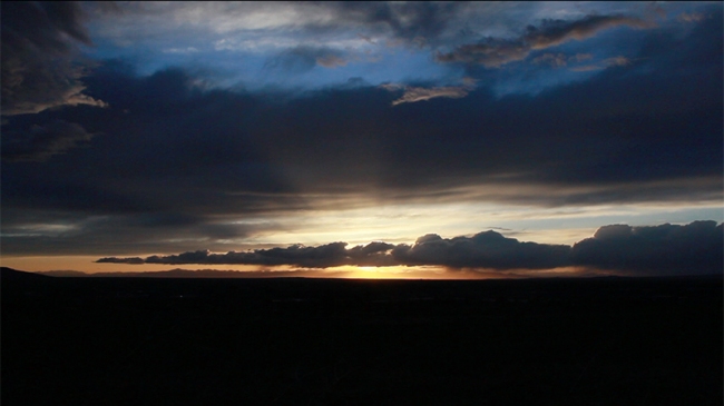
This was the most fun I’ve had up to this point in the semester. I’ve always enjoyed photography and I was blown away by the sunset that I was able to capture in a time lapse (if you care to watch 20 minutes in 10 seconds have take a look https://www.youtube.com/watch?v=FidivFJRtwE). It took a while for me to find a good location overlooking the Rexburg area but in the end it didn’t matter because to get the vibrant colors of the sky Rexburg was forced into darkness. 
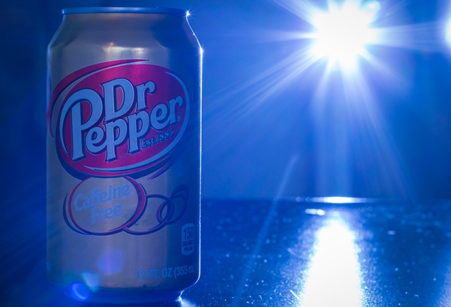
Another photo favorite of mine was the Dr. Pepper. This was made in my hallway where it was dark. I was thirsty so I grabbed a Dr. Pepper out my fridge and thought, I should take a picture of this. I then grabbed a chair from my room. Sat the Dr Pepper on it, my camera on my tripod and my little flashlight. I set my setting to 2 seconds, open my aperture up to get that shallow depth of field, put my camera on a timer, hit the trigger ran behind my camera turned on my flashlight and pointed it back at my Dr. Pepper.